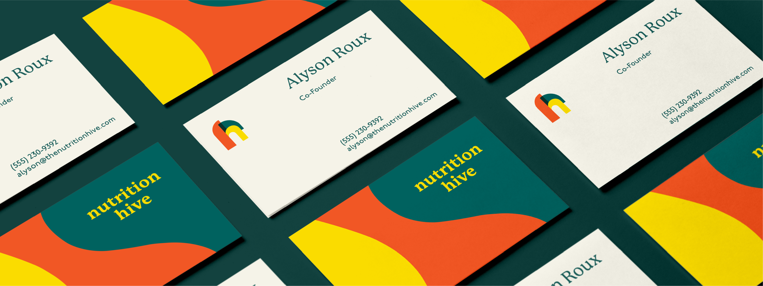
NUTRITION HIVE | BRANDING
Role: Brand Strategy, Messaging, Visual Identity
A deliciously curvy and colorful identity for Nutrition Hive, helping individuals find no-shame nutritional care from certified nutrition specialists.


Designing Nutrition Hive
In researching and creating the brand identity for Nutrition Hive, I settled on one key phrase as our core design concept:
In the wild, honey bees don’t live in neat little boxes. Bees are masters of architecture, and their hives are a wonder to look at.
Wild hives are engineered with curves and waves, rings dripping with honey. In these hives, bees work together to create the food that nourishes their community.
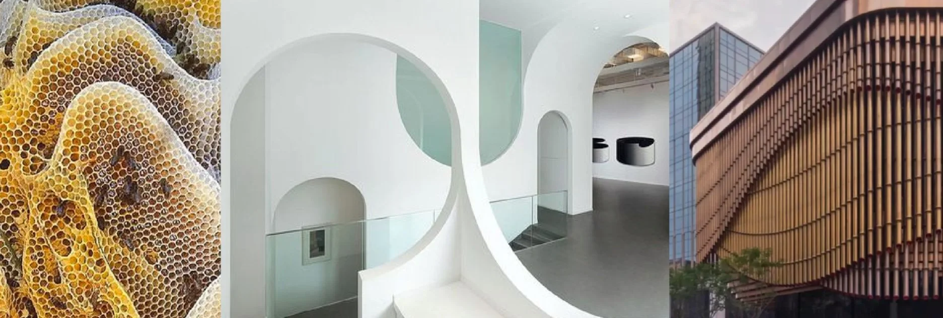
Brand strategy sessions with the client revealed metaphorical similarities between Nutrition Hive and the work of wild honeybees, driving our core design concept.

These discoveries directly translated into the final project solution: an amicable and deliciously curvy typeface paired with flavorful color and iconography inspired by the architecture of the Hive.